
11 Living Room Colour Combinations for Modern Indian Homes
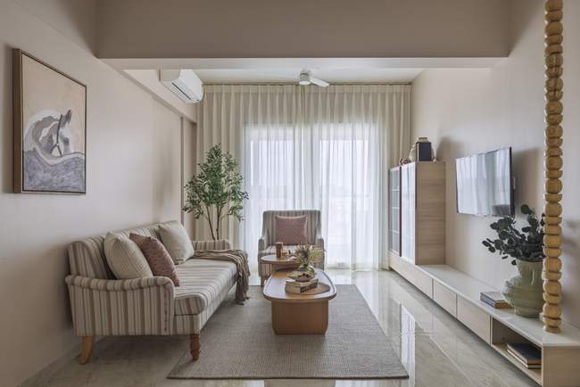
The living room is one of the most important spaces in a home. It is where families spend time together, welcome guests and relax after a busy day. The right living room colour combinations can transform the atmosphere of the space, making it feel warm, elegant, vibrant or calming.
Choosing colours for a living room involves more than selecting your favourite shades. The colours should complement the furniture, flooring, lighting and overall interior design of your home.
Whether you prefer soft neutral tones, bold contrasts or a contemporary colour palette, the right combination can help create a living room that reflects your personality and lifestyle.
At Ogling Inches Design Architects, we believe that a well-planned residential interior brings together colours, materials, furniture and lighting to create a cohesive living environment.
Here are 11 living room colour combinations to inspire your next home interior project.
1. Pale Apricot and Blood Orange
Pale apricot and blood orange create a lively colour combination that balances softness with vibrancy.
Pale apricot is a gentle, warm shade that can make a living room feel welcoming. Blood orange introduces a bold accent that adds energy and visual interest.
How to use this combination
Use pale apricot on the main walls to create a warm backdrop.
Introduce blood orange through accent walls, cushions or decorative accessories.
Pair the colours with light wood furniture and neutral upholstery.
Add soft lighting to enhance the warmth of the palette.
This combination works particularly well when the brighter shade is used selectively rather than across every wall.
2. White and Yellow
White and yellow create a bright and cheerful living room colour combination. White provides a clean backdrop, while yellow introduces warmth and a sense of liveliness.
Different shades of white, including warm ivory and creamy white, can create different effects when paired with yellow.
How to use this combination
Use warm white on the walls and ceiling.
Introduce mustard or soft yellow through cushions, artwork and accent furniture.
Pair the palette with dark brown wooden furniture for contrast.
Use natural light to enhance the brightness of the room.
For a subtle look, choose a muted yellow. For a more expressive interior, use a stronger yellow in carefully selected accents.
3. Blue and Coral
Blue and coral create a colourful combination that balances cool and warm tones. Blue can bring a sense of calm, while coral adds warmth and personality.
This combination can work well in contemporary living rooms where colour is used to create a distinctive focal point.
How to use this combination
Choose a muted blue for the main walls or larger furniture pieces.
Introduce coral through cushions, artwork or occasional chairs.
Use white or light beige to balance the stronger shades.
Add natural textures such as wood, linen or woven accessories.
A softer blue paired with muted coral can create a relaxed atmosphere, while deeper blue tones can give the room a more dramatic appearance.
4. Grey and Orange
Grey and orange create a contrast between a neutral base and a vibrant accent. Grey can provide a balanced backdrop, while orange adds warmth and visual energy.
The final appearance depends on the shades you choose. Light grey and muted terracotta create a softer look, while charcoal grey and bright orange produce a stronger contrast.
How to use this combination
Use light grey or warm grey on the walls.
Introduce orange through cushions, rugs or accent furniture.
Pair the colours with natural wood or stone textures.
Use warm lighting to complement the orange accents.
This combination can be adapted to both contemporary and industrial-inspired living rooms.
5. Bright Pink with Accent Colours
Bright pink can introduce a playful and expressive character to a living room. When paired with carefully selected accent colours, it can create a balanced and visually interesting interior.
The key is to use pink in a way that complements the rest of the room rather than overwhelming it.
How to use this combination
Pair bright pink with white or warm beige for a balanced look.
Use muted green or soft grey as a complementary accent.
Introduce pink through cushions, artwork or a statement chair.
Keep larger furniture pieces in neutral tones if you want the colour to remain the focal point.
For a more understated interior, consider dusty pink or blush tones instead of highly saturated shades.
6. Yellow, Green and Red
Yellow, green and red create a lively colour palette inspired by nature and warm, energetic tones.
The combination can appear playful or sophisticated depending on the intensity and proportion of each colour.
How to use this combination
Use a muted yellow-green shade as a secondary colour.
Introduce red through small decorative elements or accent furniture.
Balance the palette with cream, beige or other neutral finishes.
Choose softer shades for a relaxed look or deeper tones for a more dramatic interior.
Using one dominant colour and two supporting shades can help keep the room visually balanced.
7. Beige and Sand
Beige and sand create a warm, understated living room colour combination that works well in modern Indian homes.
These neutral shades can provide a versatile backdrop for furniture, artwork and decorative elements. Their subtle contrast adds depth without making the room feel visually busy.
How to use this combination
Use beige on the main walls and sand tones in upholstery or accent finishes.
Introduce natural wood furniture to add warmth.
Combine different textures such as linen, stone and woven fabrics.
Add greenery or artwork for a touch of contrast.
This palette is particularly suitable for homeowners who prefer a calm, timeless and adaptable living room.
8. Orange and Blue
Orange and blue sit opposite each other on the traditional colour wheel, creating a contrasting combination that can add character to a living room.
Blue introduces a cooler visual element, while orange adds warmth and energy.
How to use this combination
Use muted blue on larger surfaces or upholstery.
Introduce orange through accent cushions, artwork or decorative objects.
Pair the colours with off-white or light beige to soften the contrast.
Use wood and textured fabrics to make the palette feel more cohesive.
For a subtle look, choose dusty blue and terracotta. For a bolder interior, use deeper blue with stronger orange accents.
9. Green and Pink
Green and pink create a fresh and expressive colour combination inspired by natural landscapes and flowering plants.
The combination can feel soft and relaxing or bold and contemporary, depending on the shades used.
How to use this combination
Pair sage green with blush pink for a gentle, understated look.
Use deeper green with dusty pink for a richer palette.
Introduce pink through cushions, artwork or accent furniture.
Add natural wood, indoor plants and neutral textiles to balance the colours.
Green and pink can work particularly well in living rooms where the design includes natural materials and carefully selected decorative accents.
10. White and Teal
White and teal create a clean and sophisticated living room colour combination. White provides a bright, neutral foundation, while teal adds depth and a distinctive accent.
Teal can range from soft blue-green shades to deeper, more saturated tones.
How to use this combination
Use white or warm ivory for the main walls.
Introduce teal through an accent wall, sofa or decorative accessories.
Pair the palette with brass, wood or dark metal finishes.
Add artwork or a statement mirror to create a focal point.
For a balanced look, use teal selectively and allow the white surfaces to maintain visual openness.
11. Grey and Gold
Grey and gold create a refined colour combination that can work well in contemporary and elegant living rooms.
Grey provides a neutral base, while gold introduces warmth and a decorative accent.
How to use this combination
Choose a warm grey or soft greige for the main walls.
Introduce gold through lighting fixtures, decorative accessories or furniture details.
Pair the palette with cream upholstery and natural textures.
Use subtle metallic finishes to add visual interest without making the room feel overly ornate.
For a softer appearance, combine light grey with brushed brass or muted gold accents. Deeper grey tones can create a more dramatic setting.
How to Choose the Right Living Room Colour Combination
Selecting a colour palette becomes easier when you consider the room’s size, natural light, furniture and overall interior design.
| Factor | What to consider |
|---|---|
| Room size | Lighter shades can help a space feel visually open, while deeper colours can create a more intimate atmosphere. |
| Natural light | Observe how sunlight changes the appearance of colours throughout the day. |
| Furniture | Coordinate wall colours with existing sofas, wooden furniture and flooring. |
| Lighting | Warm and cool lighting can change how paint colours appear. |
| Colour balance | Choose a dominant shade, a supporting colour and a smaller accent colour. |
| Personal style | Select a palette that complements your preferred interior style and lifestyle. |
A simple approach to colour planning
Choose a dominant colour for the larger surfaces.
Select a supporting colour for furniture, curtains or secondary surfaces.
Introduce an accent shade through accessories or a feature element.
Test paint samples in the room under different lighting conditions.
Coordinate the final palette with flooring, furniture and other finishes.
How Interior Design Can Improve Your Living Room
A living room’s colour palette should work in harmony with its furniture, lighting, materials and layout.
A professional interior designer can help coordinate these elements, select suitable finishes and develop a cohesive design that reflects your preferences.
For a complete home interior project, the living room colour scheme can also be coordinated with bedrooms, kitchens and other spaces to create a consistent design language throughout the home.
At Ogling Inches Design Architects, we approach residential interiors with an emphasis on thoughtful space planning, material selection and personalised design.
If you are planning a living room makeover or a complete home interior, explore our residential interior design services in Pune.
Conclusion
The right living room colour combination can transform the appearance and atmosphere of your home. From the warmth of beige and sand to the contrast of blue and coral, each palette offers a different way to express your personal style.
Before finalising your colours, consider the room’s natural light, furniture, flooring and overall design. A balanced palette that complements these elements can help create a living room that feels comfortable, inviting and visually cohesive.
If you are planning a new home or renovating your existing space, Ogling Inches Design Architects can help you create a personalised residential interior.
Explore our residential interior design services in Pune or contact our team to discuss your project.