What is the Material Palette?
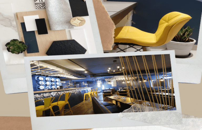
Well if you have been struggling hard on figuring out where to start, to get a cohesive look in your space, then the first most important thing to decide on is the material palette and you have come to the right place because in this blog we’ll be talking everything about the material palette and why is it so important to get a harmonious design.
The material palette includes all the elements like laminate, veneer, curtain fabric, and wall colors, which combine to give the desired style to your place. There are various Interior design styles varying from Minimalist, Bohemian, Modern Contemporary, and Scandinavian. So your first task has to be, to get a clear mindset on which design you would like your space to reflect.
Selecting a design style
Now, you can go the easy road and take one of the many online quizzes available to pick the right design style. Or you need to focus on the factors that define the style.
Modern design style

Modern is a broad design term that typically refers to a home with clean, crisp lines, a simple color palette, and the use of materials that can include metal, glass, and steel. Modern design employs a sense of simplicity in every element, including furniture. A word that’s commonly used to describe the modern style is sleek, and there is not a lot of clutter or accessories involved with a modern style.
Minimalist
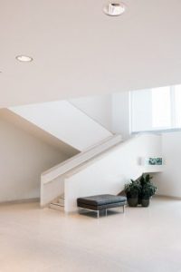
The minimalist concept is one that’s getting popularity nowadays. It takes notions of modern design and simplifies them further. Colour palettes are neutral and airy; furnishings are simple and streamlined, and nothing is excessive or flamboyant in accessories or décor. Minimalism is ultimately defined by a sense of functionality and ultra-clean lines.
Scandinavian
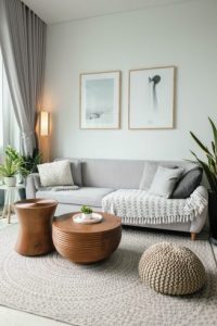
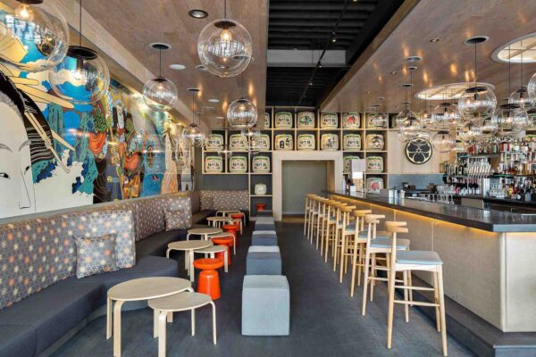
Scandinavian furniture design often feels like a work of art, although it is simple and understated. There’s functionality in the furniture along with some interesting lines, many of which have a sculptural influence. Other common characteristics include all-white color palettes and the incorporation of natural elements wood, bright plastics, and, steel, and wide plank flooring.
Get Oglinginches Blog email updates daily in your inbox
We’ll only use your email ID to send you blog updates.
See our privacy policy.
Contemporary

Modern and contemporary are two styles frequently used interchangeably. The primary difference separating the modern and contemporary design style is that modern is a strict interpretation of design that started in the 20th century. Contemporary on the other hand is more fluid and can represent a sense of currency with less adherence to one particular style. For example, contemporary style may include curving lines, whereas modern design does not.
Shabby Chic
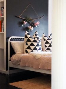
Shabby chic is a style where furniture and furnishings are either chosen for their appearance of age and signs of wear and tear or where new items are distressed to achieve the appearance of an antique. At the same time, a soft, opulent, yet cottage-style decor, often with an affected feel is emphasized to differentiate it from the genuine period decor.
Bohemian
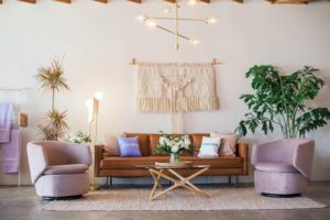
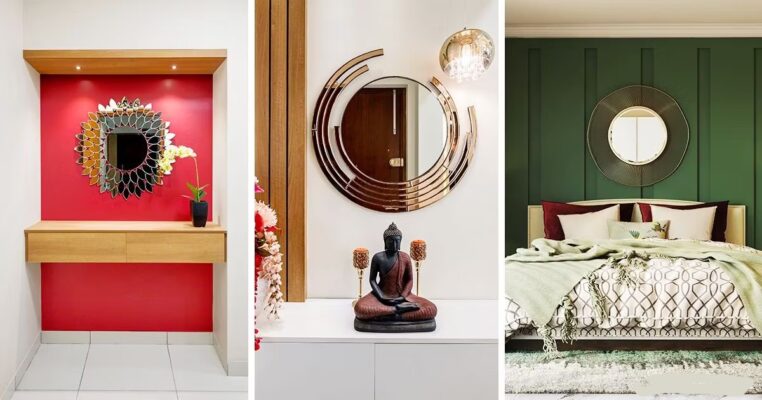
It’s a bright, patterned, multi-cultural melange of memorable layers and elements you simply can’t miss or forget for its uniqueness. The word ‘bohemian’ refers to someone who is socially unconventional and often involved in the arts, making it a great interior design option for a rich and heady space full of visual interest and a relaxed spirit.
Color scheme
Well, once you are done selecting your interior style, your next step would be to pick a color palette.
The color wheel is something that we all have studied as young child. The color wheel provides us a visual representation of which colors blend nicely together.
Once you’ve selected a basic color, it’s easy to create many different versions within the same family. All you need to do is combine that color with a neutral in order to make it lighter or darker. In interior design language, this is known as tint, shade, and tone.
Colors give us a certain state of mind, can energize us, can cheer us, can make us feel safe, calm, relax, can increase the ability to concentrate or remember us pleasant things, these things depend on the color’s temperature. When choosing the color temperature for space, you should also consider the size. Using a warm color in a tight room could make things feel a little claustrophobic. However, using cool colors in a spacious room could leave things feeling stark.
Selecting textures
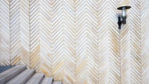
Take a cushion for example. Whether the cushion material is smooth, silky, woven or embroidered, it’s got a texture. Much like the color of a room can affect how warm or cool it feels, texture can influence the tone and weight of a room.
Talking about it, there are two types of textures that can be added to space –
Visual textures
Can be produced by color or by any pattern. A particular surface can be made to appear different to the way it feels to the touch: smooth surfaces can have visual textures, the small pattern can be ‘read’ like texture, and a faux finish can imitate the materials such as wood, brick, silk or stone.
Tactile texture
Tactile texture is produced by the physical surface texture of material – a surface can feel smooth, soft, hard, rough, rigid, grainy, or bumpy to the touch. The play of light on the peaks and valleys of an innately textured surface creates highlights and shadows which enhance the visual textures. The careful composition of texture in an interior is as important as the composition of light and color.
The scale of textural patterns should be proportionate to the size of the space and of the surfaces within it, including the scale of furnishings, window treatments, and object surfaces. Since texture can visually ‘fill’ spaces, it can be used to make large spaces feel smaller and more intimate and should be used more sparingly in smaller spaces.
If you have any questions, just comment below…We may add your questions too

