
Selecting the right interior paint colours for your home can be one of the most exhausting and confusing jobs, well of course after the furnishing. The living room is one of the busiest rooms in the house and should feel welcoming and relaxing at all times.
Finalizing one colour from the vast choices of colours can be a little overwhelming, so here is our small blog on interior house paint colours to ease up your work. The foremost important thing to do is, deciding how the room should feel. The feel of the room is majorly dependent on its colour palette.

Even a large spacious room can feel dull and cramped because of a poorly chosen home design colour. If you want the room to feel vibrant and refreshing, opt for cooler tones of the palette such as blues and greens.
Now if you want the living room to feel more cosy and comfortable, go for warmer colour tones such as coral, amber, red.
Some Decorative living room colour list mentioned below :
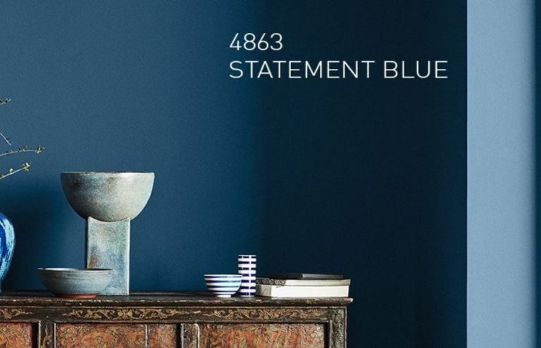
Ocean blue
Any shade of blue gives the room a calming vibe and makes it feel lighter and airier. It is one of the easiest colours to pull off a great looking living space.
You can combine them with white, cream, or brown and they’ll give out a stylish looking living room. The variety of options available in blue shades might confuse you a bit but no matter the shade, the blue colour palette will have a stabilizing effect on your home.

Ocean blue is one of the most preferred home design colours of the interior designer in Pune. Living rooms with ocean blue wall paint make a bold statement and makes you feel like you are on an island escape. You can add pop-up colours like yellow or hot pink to balance the effect of blue walls.
The above shade is by Jotun Paints
Shades of green
Green is nature’s colour, it brings energy and harmony to space. From the vast interior paint colours, green is an excellent choice for the living room.
There are many ways to introduce green into your space, for example, you can always paint your walls green but if you are that kinda person who needs white walls, you can add a variety of indoor plants, to bring in some green.

Green colour brings a splash of freshness to space, they can be both bold and soft depending on their selected shades. Mint green, sage, and pistachio are some of the subtle shades of green. It gives the room a minimalist approach and makes the room appear spacious.
Forest green, army green, and teal are however the darker shades in green make the room look more luxurious and presentable.
The above colour is by Dulux Paints.
Shades of White
A stark white room is totally timeless, but the task of choosing the perfect white can be a nightmare.
Is it simply white, pure white, or off white that will look good in your colour palette? Interior designers in Pune recommend preparing swatches before finalizing your colour, it gives a more clear idea of how the actual colour will turn up after finishing. A single colour can look different in different lights, thus, when selecting a shade of white, it is important to consider the natural light coming into your space.

A very sharp white in the room will make it look stark and blunt. It is preferred to have a blue tinge in white to balance off the warm tones of sunlight. Cool-toned white makes the room feel chilly and crisp, look for something that has a touch of grey to soothe the effect of colour in the space.
If you want the furniture pieces to be to a focal point and do not want to attract any attention to the walls, go for neutral whites. Neutral white showcases a crisp environment but also adds depth to space. Many whites turn to look cream if used in a glossy finish, so if opting for glossy wall paints, neutral white is the safest bet.
A shade you call black
Black is both modest and arrogant at the same time amongst the interior paint colours. It is among the top home decor colour trend for a living room after grey.
It can instantly elevate any space and make the room feel eternally fashionable. Adding black to your living room colour palette is surely a good decision but you need to keep in check the amount of colour you invite to space.

Too much dark shade can kill the light coming into space and can make it look dull and insignificant. The best way to balance black is to combine it with neutral textures such as sofa cushions, area rugs, or large canvas paintings. Well, many Indian families associate black with negativity and try to avoid them overall. But if you want to add black in your living room and do not want to commit too much to it, a smart option is to go for the ceiling.
The darker ceiling makes the room feel more intimidating and creates a cosy comfortable environment.
Project Enquiry
Greige
Somewhere between grey and cream, there is a colour we call, Greige. If you want a warm feel living room but cannot decide between grey and cream, there are a ton of greige shades you need to check out.
It is one of the simplest colour schemes to follow as it throws no surprise it the eyes and can make the room look magnificent. The warmer undertones in the shade make the room look spacious and it can easily blend in with every other home design colour. If you want the room to look more crisp and stark, select a shade that has more of a grey tone in it.

What makes the room feel more inviting and bright, is how it complements the bolder accent colours. You can simply ornament the space with modern artwork, jute rug, and classic furniture pieces for a greige colour scheme living room to look splendid.
Gray
Gray is the colour of all theory, it makes the room look serene and elegant. It has the power to experiment with pops of colour and still look sophisticated enough. It is one of the most popular interior paint colour choices for every room in the house.
It provides a nice backdrop for your funky decor, textured upholstery, and furniture pieces. A light shade of grey makes the living room look sumptuous and less stark as opposed to typical white. Whereas a darker shade can make a look more dramatic and luxurious. If paired with colourful tone fabrics, it can cheer up space.

Gray is a subtle colour that looks brilliant in both formal set-up and a more relaxed arrangement because of its endless versatility. Selecting from these vast shades of grey can be a bit daunting task. So we have a few of our favourite shades from the home decor colour trend and can make any space look spectacular. Silver-gray 0615, Shadow dance 8303, Steel 6412, Deep Mine 8246 – Asian Paints India catalogue.
A pinch of purple
Well, I’m sure this is not what you might have expected, but I think this shade has long-overdue attention in the home design colour. It is one of the best shade to immediately liven up your space, you can either go for a hardcore lilac colour scheme living room or just add a touch to your upholstery or decor.

The shades lilac and lavender are versatile and easy to add to your space, even adding them to a contemporary colour palette will work wonderfully with clean furniture and simple decor pieces. The secret to introducing this hue in your colour palette is to focus on its blue undertones, this colour can be substituted with blue in many places.
A tried and tested method of Interior designer in Pune, is to wash your living room walls in a pastel lavender, instead of painting them in typical white. This adds colour to space but since it spreads around the whole space, it will not become a focal point and will perfectly blend in with the aura.
Red for the bold
There is no colour bolder than red, the shade symbolizes confidence and power. Even a small section of red in the space will make a bold passionate statement.
Although if not used in the right way it can sometimes engulf the room in its hue. The safest bet is to go for richer shades of red such as crimson red, brick red, or terracotta red, these shades won’t make your space look like a fire station or a pizza hut outlet. Red is again from the warmer section of the interior paint colour palette, it makes the room feel comfortable enough to have deep conversions and formal enough for your office parties.

The shade is in the top home decor colour trends. Using the right shades can make a living room look eclectic and will drive the guest’s interest in the space. Pair your red with some royal blue, green, or orange to make a strong statement, it doesn’t always need to be a neutral shade.
The role of the colour scheme in bringing out a great design is very important. Randomly selecting any colour of the shade card can end up looking harsh, if not giving a proper thought. We hope our blog on interior house paint colours will help you in making the right decision.
Still, if you are not sure about which colour scheme to choose, go for the neutrals, they are tried and tested and cannot go wrong. You can rock any space with a neutral scheme colour palette.
