
Does your living room look more like a furniture showroom than a cozy space? You might think you know all about interior design, but this busy room often has surprising design flaws.
Interior design isn’t simple. You just need to understand lighting, room size, scale, decor placement, and color coordination to create the perfect living room. We’ve found that poor furniture layout, too much stuff, and bad lighting are common mistakes that can make living rooms feel uncomfortable and awkward.
We’ve put together 15 revealing interior design tips to help fix the mistakes you might be making in your living room. Let us show you how to transform your living room from a design mess into the welcoming space you’ve always dreamed about.
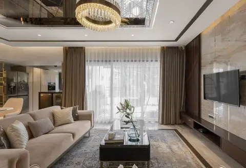
The Wall-Hugging Blunder: Pushing All Furniture Against Walls
People often believe pushing sofas and chairs against the walls of their living room creates a shortcut to good design. Professional designers call this “the wall-hugging blunder” – one of the most common mistakes homeowners make repeatedly.
Why This Interior Design Mistake Happens
The wall feels like a natural boundary for furniture placement. People think pushing furniture against walls creates more space. This belief comes from a misconception that more open floor area makes rooms feel bigger. Homeowners also feel unsure about “floating” furniture and worry about awkward spaces behind sofas or chairs.
Many people struggle to see other ways to arrange their furniture without proper planning. Rectangular rooms make this even harder since the layout seems predetermined by the room’s shape.
How It Affects Room Flow and Conversation
Empty central spaces feel barren and uninviting when all furniture hugs the walls. This setup disrupts natural social interaction by keeping conversation partners far apart and makes it hard to connect naturally.
“When you position furniture in the center of the room, it encourages conversation and interaction for a more intimate space,” notes designer Michael Mitchell. Rooms end up working more like hallways than living spaces with wall-hugging layouts. These spaces feel cold and disconnected instead of welcoming.
Simple Layout Adjustments for Better Living Room Design
Your furniture should sit at least 12 inches away from walls to let the space breathe. Larger rooms benefit from furniture moved toward the center to create cozy conversation areas. A floating furniture “island” can revolutionize your room’s dynamics.
Balance comes from placing similar sofas or chairs across from each other. Even different pieces create symmetry with matching proportions. Boxy rooms come alive with diagonal arrangements that add dimension and create welcoming paths into seating groups.
When Wall Placement Actually Works
Wall placement makes sense in small spaces sometimes. Working the perimeter becomes practical when floor space is limited. Yet you should still pull your main seating piece slightly away from the wall.
Rooms with beautiful architectural features like fireplaces or large windows benefit from strategic wall placement. Just leave enough room to move around – at least 2-3 feet of walking space between furniture pieces.
The Lighting Nightmare Blunder: Relying on a Single Ceiling Light
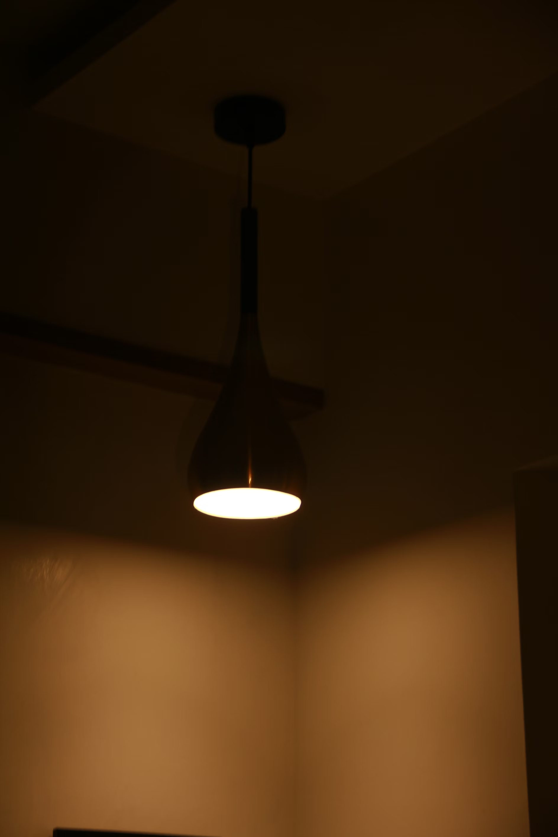
That single overhead light in your living room casts shadows and does you no favors. Many homeowners rely on just one ceiling light. This creates harsh lighting that flattens your space and makes it feel unwelcoming.
The Psychology of Layered Lighting
Light shapes how we feel about a room. A single light source covers your space with uniform lighting that feels stark and clinical. Layered lighting adds depth and visual interest that supports our psychological needs. Warm lighting at lower color temperatures (around 2700K) creates a cozy, intimate feel. Brighter, cooler lighting helps you stay focused and energized.
Good lighting helps regulate our circadian rhythms and lifts our mood. Research shows that well-designed lighting can make you happier and more energetic throughout the day. Dimming lights in the evening lowers blood pressure and helps you relax—just what you need after a busy day.
Essential Light Sources Every Living Room Needs
Your living room needs these three distinct lighting layers:
- Ambient Lighting: This light forms your room’s foundation. You can add cove lighting, LED strips in recesses, or lights on top of tall furniture to create a soft, indirect glow.
- Task Lighting: These focused lights help you see what you’re doing. Floor lamps with swivel arms work great as reading lights behind sofas. Table lamps near seating areas let you read or chat comfortably.
- Accent Lighting: These lights showcase your room’s best features, artwork, or decorative pieces. Eye-level wall sconces, picture lights, and directional spotlights create drama and depth.
How to Create Ambient Lighting on a Budget
You don’t need deep pockets to create sophisticated layered lighting. Start with dimmer switches—a simple DIY project that lets you control the mood. Mirrors placed strategically increase your existing light and create an illusion of more brightness.
Plug-in wall sconces cost less than hardwired versions and save you electrician fees. Floor sockets near the room’s center help hide lamp wires. String lights add affordable ambient light to alcoves or shelving.
Quality matters more than quantity in lighting. A few carefully chosen, well-placed lamps create better ambiance than many cheap fixtures. Place your light sources at three different heights to add dimension and get rid of those harsh shadows from your ceiling light.
The Rug Size Blunder: Going Too Small in Your Living Room
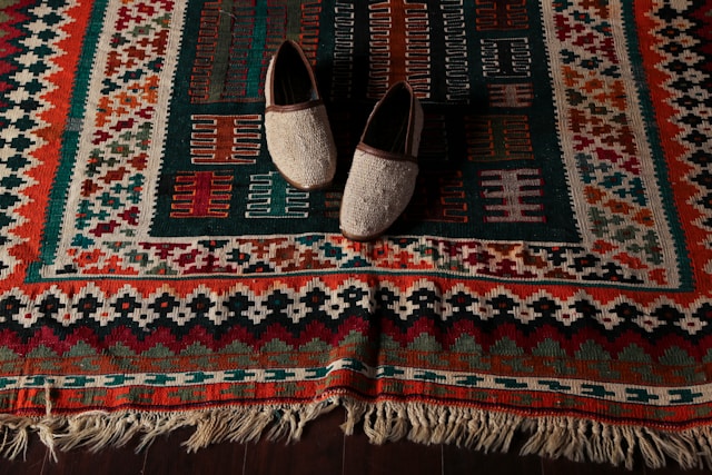
Your living room might hide one of the worst design mistakes right under your feet. A rug that’s too small throws off the visual harmony. Even your carefully chosen furniture pieces look out of place and disconnected.
The Golden Rules of Rug Placement
The basic rule of picking a rug is simple: go bigger than you think you need. Design experts say homeowners often pick rugs that are too small. Your rug should bring together all the main furniture pieces in your living space.
Your furniture legs should sit on the rug, especially when no pieces touch the walls. If you’re on a budget, just make sure the front legs of your sofas and chairs rest on the rug. This keeps everything connected and looks consistent.
The rug needs to stick out 6-8 inches beyond your sofa on each side. You should also leave 18-24 inches of bare floor between the rug edges and walls. This creates the best look in most rooms.
How Undersized Rugs Disrupt Visual Balance
Design pros hate tiny rugs that float in space—especially ones that only fit under a coffee table. Small rugs break up rooms into weird zones and make them look unimpressive.
Small rugs change how we feel in a room. They make spaces look smaller instead of larger. The eye gets drawn inward and the room feels cramped. The whole way people move and talk in the space feels off.
A well-placed rug brings balance and harmony to your living room. Rugs that are too small fail to pull furniture groups together. This leaves the room looking unfinished and poorly designed.
Ideal Rug Dimensions for Different Room Sizes
Standard living rooms work well with these rug sizes:
- 5’x7′ – Works in small spaces with less furniture
- 8’x10′ – Perfect for average living rooms
- 9’x12′ – Great for bigger seating areas
- 12’x18′ – Fits spacious open-concept rooms
A 12’x12′ room needs at least a 10’x10′ rug. This leaves 1-2 feet of bare floor around the edges. Sectional couches should sit completely on the rug to create a solid foundation.
Love a rug that’s too small? Try putting it on top of a bigger natural fiber rug like sisal or jute. This adds visual interest and keeps the right proportions.
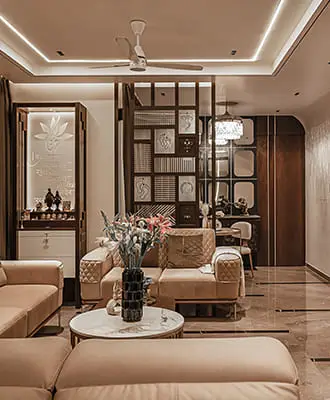
The Showroom Syndrome Blunder: Matching Furniture Sets
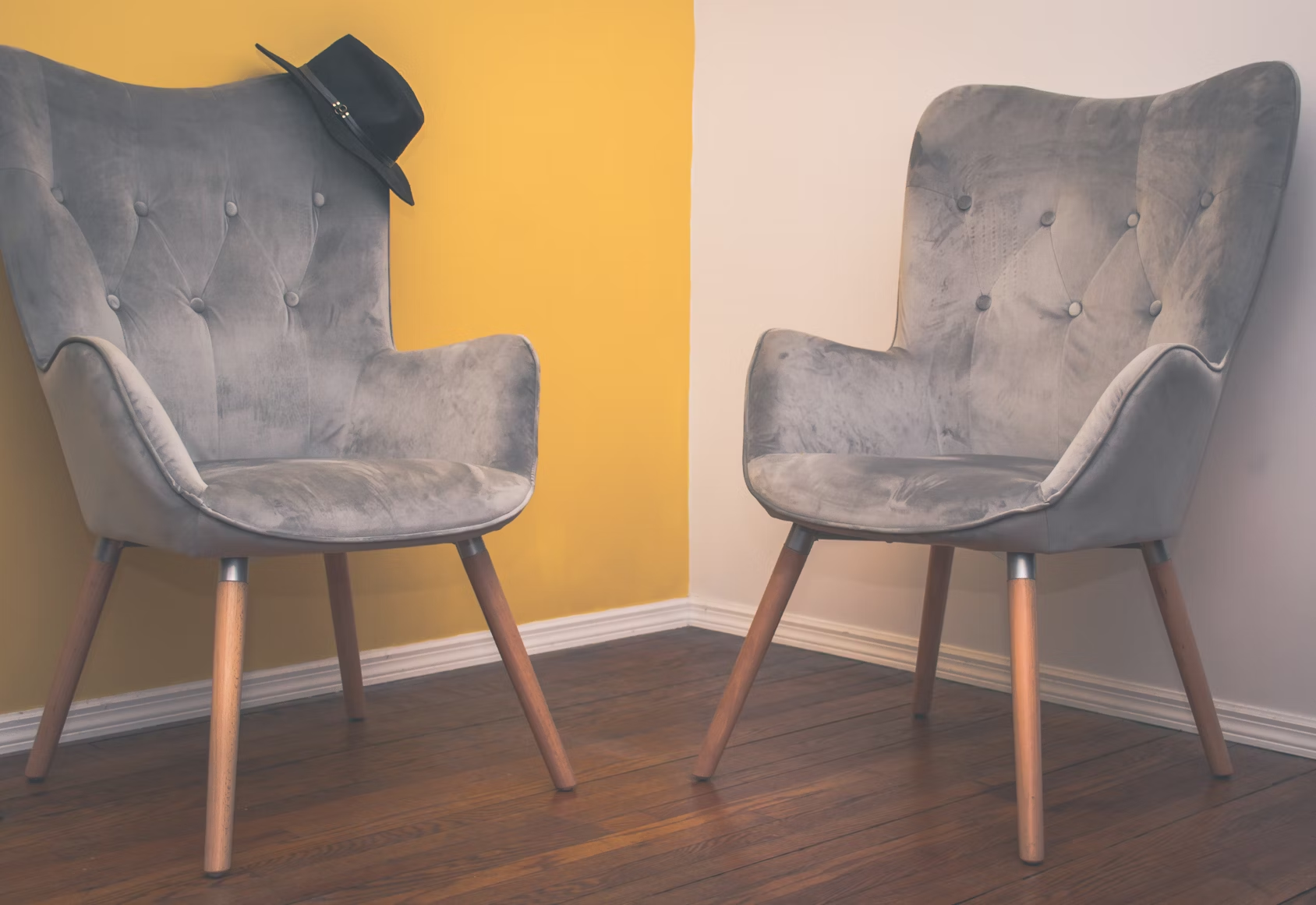
You might think buying a matching living room set at a furniture store is the easiest way to furnish your space. In spite of that, this approach—what designers call “showroom syndrome”—stands out as one of the most common interior design mistakes in homes today.
Why Designers Avoid Matching Sets
Professional designers stay away from matching furniture sets because these lack personality and individual character. The result feels sterile rather than lived-in at the time every piece shares similar finishes, styles, and details. Furniture retailers still sell these coordinated sets, yet contemporary design circles view them as outdated.
“Very few design enthusiasts decorate with furniture sets these days,” notes interior design expert Jessica Helgerson. Yes, it is true that matching sets create what designers call a “showroom-perfect” appearance. This lacks the depth, character, and visual interest that makes spaces feel personal and well-curated.
How to Mix Pieces While Maintaining Cohesion
Mixing furniture needs thoughtful planning instead of random selection. A straightforward approach helps beginners maintain a consistent color palette that connects different pieces. The key lies in selecting 2-3 core colors to build harmonious foundations even as styles change.
Balance plays a vital role when mixing styles. These strategies can help:
- Look for common elements like similar materials, finishes, or shapes
- Bridge different styles with transitional pieces
- Pick a standout piece as focal point and build around it
- Keep similar proportions between non-matching pieces
Texture adds richness to your selection process. The visual narrative becomes richer without matching pieces when you mix soft fabrics with hard surfaces or combine geometric patterns with organic shapes.
Budget-Friendly Ways to Break Up Existing Sets
Complete replacement isn’t needed if you already own matching sets. A simple swap of one element makes a difference. Nightstands or accent tables offer the easiest starting point. This small change adds visual interest right away and breaks the monotony.
Repainting or refinishing one piece in a contrasting yet complementary color works just as well. To cite an instance, see how a matching brown wood set transforms when you paint the coffee table in a bold accent color that matches your room’s color scheme.
Accessories offer an affordable way to break up the matching-set look. Your space gains cohesion while reducing uniformity when you add different lamps, throws, or decorative items with similar materials or finishes across furniture pieces.
The Comfort-Sacrificing Blunder: Choosing Style Over Function

People make their biggest living room mistake by chasing picture-perfect interiors at the expense of comfort. Such misplaced priorities create spaces that shine in photos but fail miserably during daily use.
Balancing Esthetics with Everyday Livability
Comfort is the life-blood of any well-designed living room. That sleek modernist sofa with razor-thin cushions might catch your eye, but would you really want to spend movie night lounging on it? A successful living room design needs furniture that blends both style and comfort seamlessly.
Modern designers place conversation and quality time first in their furniture layouts. They arrange seating to help interaction rather than just visual appeal. Your space should mirror your personality while meeting practical needs. This approach means picking furniture that not only catches the eye but delivers lasting comfort for everyone.
Testing Furniture Before Purchasing
You should never buy a sofa without trying it first. Showroom visits let you check comfort levels, material quality, and ergonomics—things you can’t judge from online photos. The best way to test is to sit or lie down naturally, just as you would at home.
While testing, think over these factors:
- Seat depth should let you sit with back support while your feet touch the floor
- Cushion firmness needs to support you without feeling too stiff
- The backrest must support your entire back, especially the lumbar region
Online shoppers should review return policies or trial periods carefully. This gives peace of mind when buying items sight unseen.
Stylish Alternatives to Uncomfortable Trends
Uncomfortable furniture trends have stylish, comfy alternatives available. Plush options with clean lines in performance fabrics resist stains and work better than rigid minimalist sofas. Loveseats and compact sectionals blend comfort with style perfectly for smaller spaces.
Materials play a huge role in both looks and comfort. Soft upholstery choices like cotton, linen, or velvet create welcoming spaces while maintaining sophistication. Storage ottomans that double as seating add practicality without compromising style.
Note that luxury without livability creates frustrating, impractical spaces where looks matter more than function. Yet focusing only on comfort might leave you with rooms that lack the sophistication you’re after.
The Scale Disaster Blunder: Disproportionate Furniture Choices
Your living room furniture can look awkward and out of place if you get the proportions wrong, even with expensive pieces. Most homeowners misunderstand scale—how objects relate to room size. This might be the most crucial aspect of interior design.
Understanding Room Proportions
Scale and proportion may sound alike, but they mean different things. The room’s size compared to an object defines its scale. The relationship between different objects creates proportion. Your space will feel uncomfortable and confusing if these elements don’t work together.
Room assessment should include square footage and ceiling height. Interior designer Alex Thies shares her approach: “My general rule of thumb is that your sofa should be the tallest seating in the room, your end tables should not be any taller than the arms of the sofa”. This setup creates visual harmony instead of competing elements.
Common Scale Mistakes in Small vs. Large Rooms
Small spaces often suffer from undersized furniture choices. Designer Joan Enger explains: “Many people often assume they should buy small-scale furniture for small living rooms, but that actually makes a space feel smaller”. The better approach is to pick fewer pieces of the right size that allow breathing room.
Large rooms come with their own set of challenges. Small furniture pieces get lost in spacious settings. Designers suggest taller pieces for rooms with high ceilings to maintain proper visual weight. You should map out dimensions with painter’s tape on your floor before buying furniture to see how pieces will fit.
The Rule of Thirds in Furniture Arrangement
The rule of thirds helps create perfect balance. Designers split spaces into a three-by-three grid and place furniture at strategic intersection points for the best visual appeal.
Your focal piece, usually a sofa, should sit along one vertical grid line rather than the center. The visual weight needs distribution across the grid so each section feels balanced. This approach creates natural flow and harmony between different-sized objects in your living room.
The Focal Point Failure Blunder: Not Establishing a Visual Anchor
A living room with beautiful furniture might still feel off if it lacks a clear center of interest. The focal point acts as a visual anchor that draws your eye, adds depth and brings harmony to your space.
Natural vs. Created Focal Points
Every living room needs a dominant feature that grabs attention. Natural focal points are architectural elements built into your space—fireplaces, large windows with striking views, built-in bookcases, or distinctive architectural details. Created focal points come into play at the time natural options aren’t available or compelling enough. These could be statement furniture pieces, dramatic artwork, or bold accent walls.
Your room might feel directionless and visually confusing without proper emphasis on the natural focal point.
How to Boost Your Living Room’s Natural Focus
The furniture arrangement becomes significant once you spot your room’s natural focal point. Place your seating to highlight this feature instead of competing with it. You can arrange sofas and chairs around a fireplace to make it stand out.
Colors can strategically emphasize your focal point. An accent wall frames a fireplace nicely, while vibrant curtains make a window with an impressive view pop. On top of that, built-in shelving can expand architectural features and widen their visual effect.
Using Art and Lighting to Create Focal Interest
Large-scale artwork can establish a compelling center of interest if natural focal points don’t exist. A gallery wall or oversized painting creates immediate visual impact.
Lighting proves powerful to create or boost focal points. Here are some approaches:
- Accent lighting like spotlights or wall sconces to highlight artwork or architectural details
- Statement lighting fixtures (chandeliers, pendant lights) that become focal points themselves
- Strategic light placement to create contrast and draw the eye
Note that larger rooms can handle multiple focal points, as long as they don’t compete for attention. The core team maintains visual hierarchy—one dominant feature with supporting elements creates a cohesive, balanced living space.
The Curtain Catastrophe Blunder: Hanging Drapes Too Low or Short
Your living room’s design can be ruined by poorly hung curtains, even with beautiful furniture and a perfect color scheme. Designers call the awkward sight of short drapes floating above the floor “high-water curtains” – one of the most noticeable design mistakes.
The Correct Height for Curtain Placement
The foundation of stylish window treatments starts with proper curtain rod placement. Your curtain rod should be mounted 4-6 inches above the window frame to add height and create spaciousness. A dramatic effect emerges when you position the rod just below the ceiling, making windows look taller instantly.
The width is equally important as height. Your curtain rod should extend 4-10 inches beyond each side of the window frame. This placement lets you draw curtains back completely, which maximizes natural light and makes windows appear larger.
How Proper Window Treatments Transform a Room
The room’s perceived dimensions change dramatically with correctly hung curtains. Higher curtain placement draws eyes upward and creates an elegant atmosphere with seemingly taller ceilings. This simple change can make your living room feel more expansive and sophisticated.
Properly hung curtains offer practical advantages beyond looks – from privacy and light control to better energy efficiency. These vital design elements blend functionality with visual appeal and tie other decor pieces together naturally.
Selecting the Right Curtain Length for Your Space
Design mistakes often stem from incorrect curtain lengths. Short curtains make rooms feel unfinished and visually lower ceilings. This common design error appears in many homes.
The best curtain length allows fabric to “kiss” the floor – barely touching without pooling. You can also consider these approaches:
- Floating: A 1/2 inch gap above the floor works well in busy areas
- Breaking: The fabric creates a small fold at floor level
- Puddling: Extra fabric of 3-6 inches creates an elegant, formal appearance
Standard curtain lengths (84″, 96″, 108″) rarely match your exact needs. Choose longer lengths since hemming is simpler than adding length.
The Personality Void Blunder: Creating a Generic Living Room
A well-designed living room with great lighting and proportions might still feel empty without a vital element—your personality. Walking into a generic space feels like entering a furniture showroom: sterile, cold, and characterless.
Incorporating Personal Elements Without Clutter
Your unique style and priorities should guide your design choices. Personal touches create authentic spaces that connect design principles with real life. Display meaningful mementos, family photos, or travel souvenirs to build emotional connections with your space.
Book lovers can spread their collections throughout the living room. Books naturally start conversations when you share your space on social media or host guests. Look beyond traditional photos and frame unexpected items such as handwritten family recipes, meaningful letters, or vintage textiles.
Statement Pieces That Tell Your Story
The right statement furniture turns generic spaces into personal sanctuaries. Think over these options:
- A coffee table made from unexpected materials like glossy granite rather than standard wood
- A bold emerald green sofa or deep wine armchair that breaks free from neutral colors
- An antique piece repurposed creatively
- Art that anchors your entire design scheme
According to Geeta Arya, “Whether it’s a classic loveseat, a modern L-shaped design, or a cozy velvet sofa, it brings an air of elegance”. Well-chosen statement pieces become visual anchors that spark conversations and inspire creativity.
Balancing Trendy with Timeless
The perfect balance between trendy elements and timeless design creates spaces that stay relevant as styles change. Homeowners should evaluate how long they plan to keep their design unchanged. Trendy designs might need frequent updates as fashions evolve.
Classic, enduring elements should ground your space while modern interior design trends appear in adaptable accents. This strategy builds a living environment that stays sophisticated and fresh without chasing every new trend.
Interior designer Elizabeth Roberts emphasizes: “It’s important to mix new and vintage elements in order to create an interesting, eclectic, and individualized room”. This thoughtful combination ensures your living room reveals your story, not a generic retail display.
The Color Chaos Blunder: Poor Color Scheme Execution
A poorly chosen color scheme can ruin a well-designed living room. The perfect furniture layout and proper lighting won’t help if clashing colors create visual chaos. This disharmony makes spaces feel uncomfortable and chaotic at a subconscious level.
Understanding Color Psychology in Living Spaces
Our emotions and behaviors respond strongly to colors. Living rooms benefit from red’s energy-boosting and conversation-stimulating properties, though too much can overwhelm. Blue brings a sense of calm and relaxation that people trust. Natural wood tones pair beautifully with green, which connects us to nature and creates peaceful surroundings.
The color selection process shows that warm colors (reds, oranges, yellows) energize spaces, while cool tones (blues, greens, purples) bring tranquility. People’s priorities might differ, but most respond to certain color families in predictable ways based on psychological connections.
Creating a Cohesive Color Story
The 60-30-10 rule guides professional designers: 60% goes to a primary color (usually walls), 30% to a secondary color, and 10% to accent colors. This balance will give a visually pleasing space without overwhelming anyone’s senses.
Start by spotting elements you can’t change—existing flooring, stonework, or architectural features. These are the foundations of your color palette. Harmony comes from choosing colors that share a similar temperature, whether all warm or all cool.
Your living room’s visual connections matter—what other rooms can people see from there? A uniform color in hallways and landings creates natural flow even when individual rooms look completely different.
Common Color Combinations to Avoid
Using equal amounts of three competing colors creates tension instead of harmony. Colors with similar saturation levels need neutral shades between them to work well.
Neutral spaces can become boring when everything matches too closely. Adding texture and slight variations in neutral tones prevents this common issue.
Color samples need testing at different times throughout the day. Light changes can transform how colors look—what seems perfect at noon might look completely different in evening light.
The Accessory Overload Blunder: Too Many Decorative Items
Your living room surfaces might be drowning in decorative items. That collection of trinkets, photo frames, and ornamental pieces could undermine your design scheme. While accessories add personality to a space, an overflow creates visual clutter that disrupts the room’s harmony.
The Art of Curating Accessories
Thoughtful curation rather than random accumulation makes accessorizing work better. Scattered small decorative items create chaos instead of cohesion in your room. You should group similar pieces together to make a stronger visual impact.
Home magazines showcase that professionally styled look through layering—mixing materials and textures while keeping enough negative space for the eye to travel comfortably. Balance plays a crucial role when styling surfaces because your brain notices missing symmetry.
Small accessories that might add to clutter need a unified “footprint.” Place them on a tray, stack of books, or in a shallow bowl. This technique transforms scattered objects into a well-thought-out collection.
Quality vs. Quantity in Decor
The principle “less is more” stands true in minimalist and well-designed interiors. You should invest in fewer but higher-quality decorative pieces that make strong statements rather than many inexpensive items. Each piece in your living room needs to contribute meaningfully—no weak links allowed.
Avoid covering every surface with knick-knacks. Interior designers suggest limiting tabletops to just three to five decorative items maximum. They recommend clearing your surfaces first, then selecting only the most influential pieces to display.
Rotating Seasonal Decor to Maintain Interest
Your decor can change throughout the year. Seasonal rotation brings freshness without requiring new purchases. Spring calls for replacing heavier winter textures with lighter options like linen and introducing botanical prints or fresh blooms.
A storage system for seasonal accessories lets you swap pieces as seasons change. These items feel refreshed and exciting when they return to your space after months away. This approach helps update your living room with changing trends while your core design esthetic remains intact.
The Artwork Alignment Blunder: Improper Hanging Heights
Professional interior designers spot artwork hung at wrong heights right away. A quick look inside most homes reveals art placed too high on walls. Many homeowners don’t realize this creates visual discomfort.
The Perfect Height Formula for Wall Art
A simple yet practical rule guides most designers – art should have its center point between 57 and 60 inches from the floor. This height lines up with the average person’s eye level, which lets viewers see the art without straining their neck. Households with shorter family members should stick to the lower end of this range.
Here’s how to find the right spot:
- Take your artwork’s height and divide it by two to locate its center
- Make a mark 57-60 inches up from the floor
- From this mark, subtract half the artwork’s height to find where the frame’s top should go
The rules change for art above furniture. You should place the bottom edge 6-12 inches above your sofa, console, or table. This creates a visual connection between the art and furniture instead of letting pieces float randomly on the wall.
Gallery Wall Arrangement Tips
Gallery walls work best when treated as one unit – the middle of the entire collection should still hit that 57-60 inch sweet spot. Your grouping looks more polished with even spacing between frames, about 2-3 inches apart.
Start by laying out your arrangement on the floor or use painter’s tape to mark the wall. The center piece goes at eye level first, then build the rest around it. Grid-style galleries need exact spacing since small alignment mistakes stand out.
Sizing Artwork Appropriately for Your Walls
Your wall’s size should match your artwork’s dimensions. Small pieces look out of place on large walls. The 2/3 rule helps you get it right – art should take up about two-thirds of the furniture width below it.
Big walls call for large pieces or gallery arrangements that fill the space. Art placed correctly changes rooms by creating focal points and bringing balance to your living space.
The Traffic Flow Blunder: Blocking Natural Pathways
A well-arranged living room can still feel off if you miss one vital factor—the natural way people move through the space. When pathways get blocked, it creates annoying obstacles that mess up your room’s flow and function.
Mapping Movement Patterns Before Arranging Furniture
Start by identifying the main routes that connect doorways, seating areas, and focal points before you place any furniture. This step helps avoid creating bottlenecks or weird walking paths. You should really measure your space and sketch the room’s dimensions, including all doorways, windows, and architectural features. This basic planning will give a clear picture of tricky spots and make sure furniture won’t get in the way.
“Sketching helps you visualize the space and prompts your mind to see the ‘problem areas’,” notes interior design expert Michael Helwig, adding that this approach creates “a visual map for the room, with every crucial dimension needed”.
Creating Invisible Walkways in Your Layout
Expert designers suggest these minimum clearances:
- Main walkways: 30-36 inches minimum, ideally 36-42 inches for primary paths
- Seating areas: 18-24 inches between furniture pieces
- Coffee table to sofa: 14-18 inches for comfortable leg room
The furniture placement affects how spacious a room feels. “If you leave too much space for the walkway, the room will feel like one big hallway,” cautions design expert Better Homes & Gardens. That’s why you should position furniture to define paths around conversation areas instead of through them.
Furniture Placement for Optimal Conversation
Your furniture arrangement should make both movement and interaction easier. Seating should be no more than 9 feet apart in conversation areas—people need to raise their voices to communicate beyond that distance. The best layouts balance cozy conversation spaces with clear walking paths.
Rooms with walkways running through them need furniture positioned to bring the space together while marking clear paths. Circular or L-shaped arrangements create natural conversation zones and direct traffic flow around social areas instead of through them.
The Technology Takeover Blunder: Letting Electronics Dominate
Tech gadgets and electronics can quickly dominate your living room’s appearance. A space overwhelmed by technology creates visual imbalance and disrupts your carefully planned design scheme.
Integrating Technology Discreetly
Smart devices blend naturally into your living space if they’re designed with esthetics in mind. Your tech selection should focus on sleek, minimal designs in neutral colors that match your existing decor. You might want to think over furniture with built-in tech features—coffee tables with wireless charging pads or consoles equipped with USB ports.
Your living room needs tech-free zones. These quiet spaces boost mental clarity and well-being, letting you reconnect without digital distractions. Large equipment like routers or hubs should go in cabinets or behind furniture to keep your room’s visual harmony intact.
Cable Management Solutions
A tangle of exposed wires can ruin your living room’s design. These solutions work best:
- Cable sleeves and covers matching your decor hide multiple cords along walls
- Adhesive cable clips in clear, black, or white keep wires neat and tidy
- Cable management boxes in rustic wooden or minimalist designs conceal power strips and adapters
Duct tape should be avoided as it leaves sticky residue and poses fire hazards. Power strips with widely spaced outlets work better to fit bulky plugs.
Balancing Screen Placement with Other Focal Points
TV placement shapes your living room’s visual balance. The bottom third of the screen should line up with your eye level while seated.
Your TV doesn’t need to be the center of attention. You could make other elements—like a fireplace or artwork—the main visual anchor, with the television as a secondary feature. Proper lighting matters too, so avoid spots where windows create screen glare.
The Budget Imbalance Blunder: Spending in the Wrong Places
Smart budget management for your living room is one of the most overlooked parts of interior design. Your space might look unfinished or wear out quickly if you don’t distribute your money wisely, even with a big overall budget.
Investment Pieces vs. Budget-Friendly Options
Quality furniture needs smart money allocation. You should spend more on pieces you use every day that affect your comfort and well-being. A sofa is your most important investment in any living room. Cheap sofas might only last 5 years, while a well-made one could be with you for decades. Your dining table deserves similar attention since it handles years of gatherings and daily use. Quality area rugs are worth the investment too – they tie your entire design scheme together.
You can be more flexible with almost everything else. Side tables, throw pillows, and decorative objects work just fine on a budget without hurting your room’s overall look. These items don’t take much wear and tear, so cheaper options make sense.
Where to Splurge and Where to Save
Your budget works better when you know what matters most:
- Splurge on: Well-built upholstered seating with quality fabrics, eye-catching lighting fixtures, and window treatments that change how spacious your room looks
- Save on: Coffee table (unless it’s your room’s centerpiece), seasonal decorative accessories, and style elements from affordable stores like CB2 and H&M Home
Put your money into things you use daily and save on decorative pieces that see little action or are easy to replace.
Long-term Value Considerations
Cost-per-use changes how you look at buying decisions. You can find a piece’s real value by dividing its price by how many years it will last. That expensive sofa might cost just pennies per day over its lifetime.
Items that serve multiple purposes or work in different rooms give you more bang for your buck. The quality of construction, solid wood, good joinery, and premium fabrics determine if your investment lasts through daily use or needs early replacement.
Comparison Table
| Design Blunder | Common Mistake Description | Biggest Problem/Result | Key Solution/Fix | Expert Recommendation |
|---|---|---|---|---|
| Wall-Hugging | Furniture pushed against walls | Empty, awkward space in center | Pull furniture at least 12 inches from walls | Leave 2-3 feet of walking space between pieces |
| Lighting Nightmare | Using only ceiling light | Harsh shadows and clinical feel | Add three lighting layers: ambient, task, and accent | Use warm lighting (2700K) for a cozy feel |
| Rug Size | Small rugs | Room feels disconnected and tiny | Place all furniture legs on rug | Keep 18-24 inches of bare floor between rug and walls |
| Showroom Syndrome | Matching furniture sets | Space looks sterile and generic | Mix different pieces while keeping harmony | Use 2-3 core colors to connect different pieces |
| Comfort-Sacrificing | Style over comfort | Spaces become unusable | Test furniture before buying | Check back support and cushion firmness |
| Scale Disaster | Wrong-sized furniture | Visual confusion and discomfort | Use rule of thirds for arrangement | Make sofa the tallest seating piece |
| Focal Point Failure | No visual anchor | Room lacks direction | Create clear center of interest | Arrange seating to highlight focal point |
| Curtain Catastrophe | Low or short drapes | Windows look smaller | Install rods 4-6 inches above window frame | Extend rod 4-10 inches past window frame |
| Personality Void | Generic spaces | Room feels cold and lifeless | Add personal items and mementos | Blend new and vintage pieces for unique style |
| Color Chaos | Bad color combinations | Visual discord | Apply 60-30-10 rule | Check colors in different lighting |
| Accessory Overload | Excessive decorative items | Visual clutter | Use 3-5 items max on tabletops | Group similar items together |
| Artwork Alignment | Wrong hanging height | Eye strain and discomfort | Center art 57-60 inches from floor | Leave 6-12 inches above furniture |
| Traffic Flow | Blocked pathways | Difficult movement | Keep 30-36 inch walkways clear | Place seating within 9 feet for conversation |
| Technology Takeover | Electronics everywhere | Unbalanced look | Hide cables and equipment | Mount TV at seated eye level |
| Budget Imbalance | Uneven spending | Incomplete look | Focus on daily-use items | Invest in quality seating and lighting |
Conclusion
Design mistakes in living rooms can happen despite our best intentions. These blunders aren’t failures – they’re valuable learning opportunities that help make better design decisions.
Great living room design strikes a balance between visual appeal and practical comfort. A well-arranged space needs proper traffic flow, layered lighting, and furniture placed in proportion. Your unique personality should shine through the design.
Simple tweaks can make a huge difference. Pull furniture away from walls, hang curtains at the right height, or choose the right-sized rugs. These changes will turn awkward spaces into welcoming ones. Smart budget choices will give lasting quality where it counts most, especially when you have high-use items like sofas and lighting fixtures.
Your perfect living room needs careful attention to design principles and your priorities. Take it one design element at a time. Measure spaces with care and test furniture before you buy. Let your living room tell your story while giving you a comfortable, functional space for daily life and guests.
Note that professional designers created these guidelines through years of experience. They’re starting points, not strict rules. Trust your gut while using these principles to create a living room that fits your lifestyle and priorities perfectly.