Before and After by Interior Designer some of the most inspiring before and after transformations done by Ogling Inches.
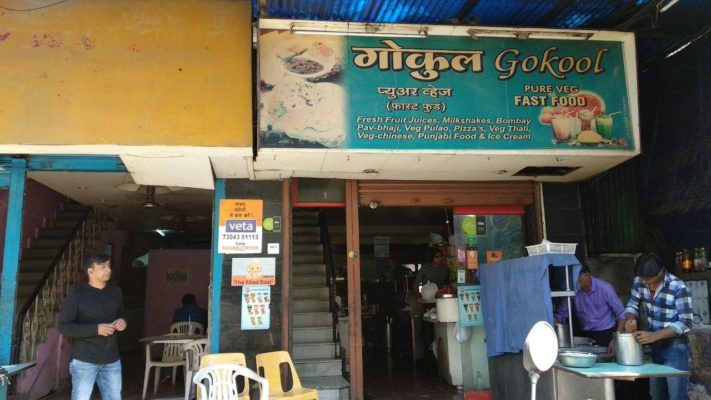
GOKOOL RESTAURANT–
Situated on one of the busiest streets of Pune, camp area. Gokool is a 5000sqft restaurant serving multiple cuisines, one of his kind for the last 25 years. It was under renovation for three months but I’m sure the results will leave you to astound.
Our aim was to preserve the unique personality this place had achieved through 25 years of service & only to enhance it exponentially without damaging the history & experience attached. Thus the design moves that ensued were an imagined contemporary interpretation of a grand bye-gone era mixed with contextual influences.
The floor is designed with a bold and alternating linear pattern of white Sadarahalli granite and Black kadappa stone. This pattern and colour combination gives a chess-board sort of feel to the floor contributing to the quirkiness.
The restaurant welcomes guests with asymmetrical metal and glass screen door that fabricates an intimate entrance foyer. Another highlight of the space is the imposing custom-designed cabana on the ground floor. And of course, where would a garden restaurant be without some gorgeous plants.
Furniture and seating arrangements are the most crucial aspects to consider while planning the layout of the restaurant. Various tones of fabrics were scoured for the upholstery and furniture. In one corner a cabana seating arrangement is presented that is ideal for those guests seeking to host a group of people. Lighting is provided by spherical pendant lamps that hang from the ceiling.
The furniture is a mix of fixed booth style seating, low tables, and low sofas ideal for lounging. Black & white flooring along with brown furniture complement the ‘turquoise and peach’ walls of the restaurant perfectly.
Get Oglinginches Blog email updates daily in your inbox
We’ll only use your email ID to send you blog updates.
See our privacy policy.
THE K FACTORY–
This uptown Restro-lounge is a sure win no matter if you’re swinging by for lunch, brunch, Happy Hour or dinner. With one of the knowledgeable chefs and wait staff in the industry, you will be guided through their delicious menu of hearty meals & divine desserts while you soak up the ambiance.
Divided into two floors, the ground floor is dedicated to experimental food dishes and the first floor committed to providing you with some stellar beverage mix and liquors.
When the manager of the restaurant came to us for remodelling of the first floor, they had a very clear idea of giving it an Aqua theme to compliment the liquid lounge.
The previous design scheme didn’t follow any striking elements and had a very subtle rather painful mood-setting, with a brown leatherette sofa cushion and exposed brick wall, which brought down the whole ambience of the space.
Thus, the design team decided to add a few engaging sections, like the liquor bottle shelving has a neon blue ring light which can be a bit trippy sometimes 
The seating arrangements were changed to accumulate 80 customers. The central seating is placed diagonally to the bar, giving them a view of the bar and dance floor at the same time. Tables are lit by rose gold, black pendant lamps and the ceiling follows a blue-black gradient.
Conclusion :
Read what I saying here, YES! That’s what you wish to hear from your clients once you start your OWN Practice.
Don’t worry too much about jumping in, Just Jump in the sea of Design, you will quickly learn to swim.


