Walk-in wardrobes or Wardrobes are separate space strictly dedicated to accommodating a person’s clothing and other personal items, such as shoes, purses, and accessories.
Space can be as big as a bedroom or as small to make space just for a person’s clothes and movement. Space should be organized in a way that feels less claustrophobic and provides easy access to all the stored items, something that cannot be achieved in a standard standalone wardrobe.
The key to a well-designed closet depends on several small features, including the layout, colour palette, storage space, etc. that one should take care of when planning the space.
Be with us as we list the top 10 attributes of a well-planned and designed walk-in wardrobe.
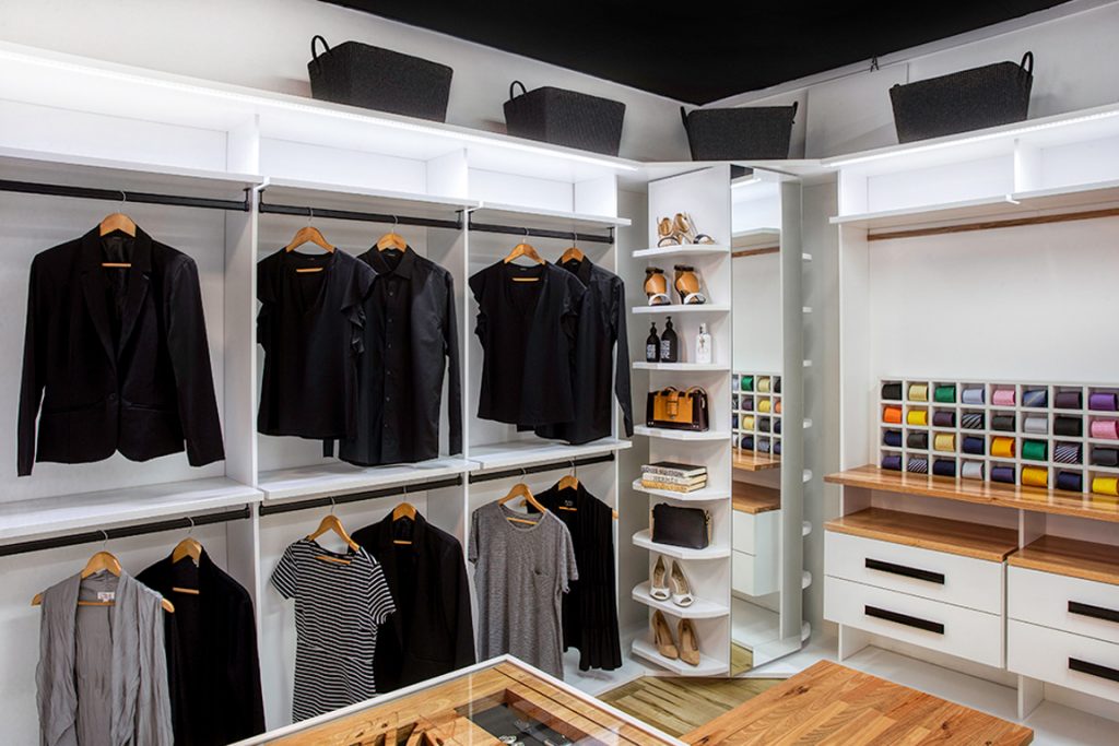
It plays one of the most pivotal roles in turning out a good wardrobe design. Depending on the space available, there can be different layouts for the same room, you need to select the one that best serves your purpose.
Apart from the floor layout, a wardrobe’s internal layout is the next key point to focus on. Categorize your belongings into sets, depending on the space required by them, type of item, usage frequency, etc.
This will help you to figure out the best organization for your wardrobe, divide it into drawers, open shelves, hanging spaces, and loft areas for items such as your suitcases.
Everyone has their own style of arranging the wardrobe, some of us like to keep the clothes folded, while others prefer more hanging space that displays their outfits perfectly.
Ideas To Plan And Design Your Wardrobe
As per the ergonomics standard dimensions, the top drawer height from the floor can vary from 36 inches to 40 inches. It is best to keep your wardrobe drawers under this height to have effortless visibility and access to the internal space. Now for the hanging area, the standard height has to be 36 inches to accommodate your shirts and 30 inches to hang folded trousers or sarees.
Tall dresses such as overcoats and kurtas can take from 48inches to as much as 60-65 inches, avoiding any puddle at the bottom. Add a separate space for your accessories such as purses, shoes, hats, etc, and strictly avoid stuffing them to the shelf bottom or inside the drawers. Styling your shoes and purses on open shelves are a great way to add décor in your closet.
Display shutters
Even in a small bedroom sometimes there can be more than 2-3 doors, each for entry, washroom, balcony, and closet space, these doors take up a considerable portion of the vertical surface available to us. Now think of the walk-in wardrobe, the majority of the area there is going to be wardrobe doors. Thus, not giving proper thought to the shutter material can end up making the room feel cluttered and small.
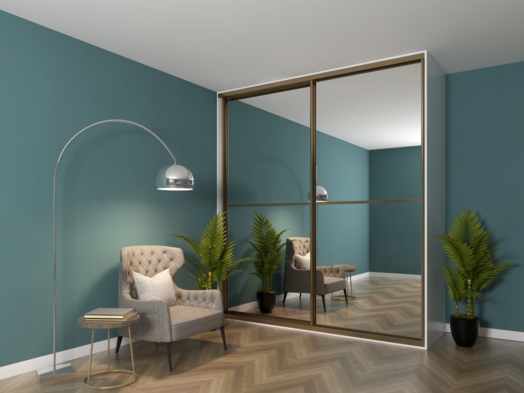
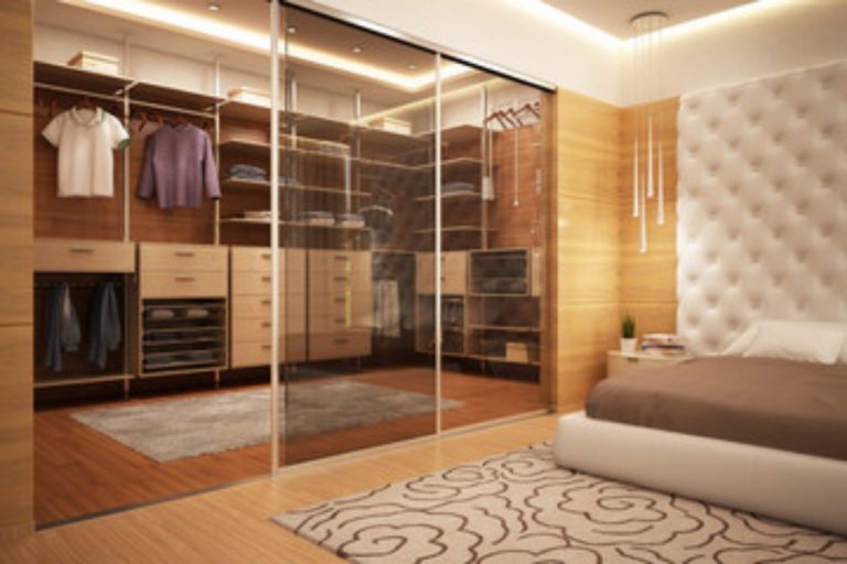
Many of us tend to bend for opaque or solid shutters, which restricts the visibility to the inside of the messy cabinet. residential interior Designers these days suggest opting for display cabinets rather than solid doors, the transparency allows to make the room feel large and also forces the user to stay organized.
Depending on the percentage of visibility you want, you can select from the vast variety of glass available in the market such as clear glass, frosted glass, flute glass, and glass films.
Build an island
What comes to your mind, when you think of a closet island, fancy right? An island not only serves as an elegant piece in the overall space but also acts as an extra storage space for your items. It provides space to add more drawers or a flat surface to fold your clothes.
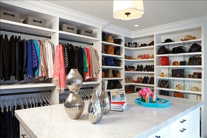
Mind the space around the island, its size may vary as per the floor availability but keep a clearance of at least 24 – 30 inches around it for you to freely walk and access the under cabinets. To add elegance in design, use stone or Corian solid surfaces on the countertop with minutely designed edge profiles.
The top of the island can also be used to display your jewellery or other accessories such as sunglasses, watches, and neckties.
Lighting
Lighting is another crucial aspect to keep in mind when designing walk-in wardrobes. As most of the area in the room is going to be dedicated to the storage space, there will be very little space remaining for windows or natural light. Good lighting helps to set the mood right and will also help to locate the stuff easily.
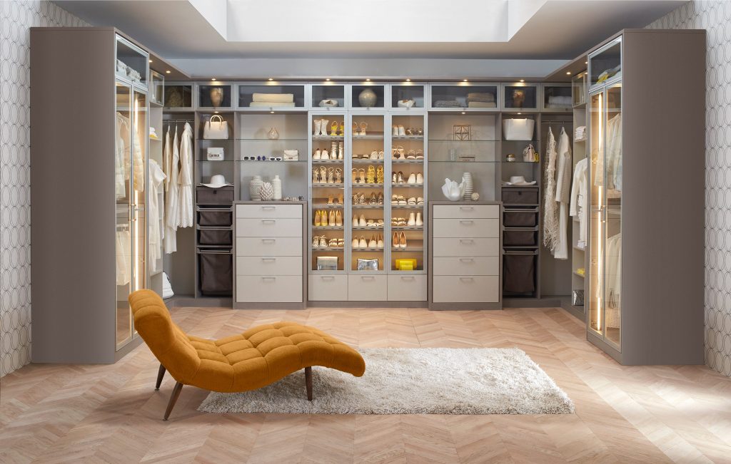
A dressing space requires adequate light to get ready, a poorly lit space can also create confusion while selecting outfits and accessories. Colours such as navy blue and black will look similar in dull lighting. Apart from general room lighting, install concealed cabinet lights that act as focus light in highlighting your belongings.
The walk-in wardrobe may have a lot of reflective surfaces, due to which it is suggested to select recessed light fixtures that will avoid creating a glare in the area.
Warm white and Natural white light temperatures are proven to be ideal for closet space, anything warmer than that will make the colour appear more yellow and anything cooler than that will produce glare and make the space look cold.
Circulation space
In a small space such as walk-in closets, it is necessary to have an adequate walking aisle. Circulation space does not only keeps in check the standard area required to freely walk without getting bumped in the furniture but it also helps in easy access to the storage space, such as drawers and bottom shelves, which might sometimes get difficult to reach.
As per the standard ergonomics study, free passage of at least 24 – 30 inches should be kept between two furniture items, this is the minimum passage width to be followed when laying your wardrobe floor plan.
If the room is large enough and you can spare a few feet, add them in your free floor space, rather than cramping up the space with island or platforms.
If there is enough space, try to keep 36inches to 40 inches free passage in the middle, to easily access both sides of the furniture. A full-height mirror or dresser should have at least 30 inches to 48 inches of free space in front of them, for a person to comfortably see themselves.
Get Oglinginches Blog email updates daily in your inbox
We’ll only use your email ID to send you blog updates.
See our privacy policy.
Play with the ceiling
In walk-in wardrobes with most of the vertical walls being used by storage and mirrors, space available to showcase a design remains very less. One of the most common mistakes people tend to do when designing a space is painting their ceiling white.
There is so much that can be done to highlight a ceiling and turning the whole ambience of the space. If going with a minimalistic design style, you can paint the ceiling in a dark shade of Grey or Greige to make the space feel cosy and comfortable. Add crown moulding and mandalas to provide a mid-century look to your closet.
If the height of the room is comparatively less, decorate your ceiling with mirror patterns to create a faux sense of height. Ceiling space can also be used to suspend shelves and hanger profiles for your outfits.
Colour Palette
The next important feature of good design is its colour palette. Select your colour scheme as per the room size, dark shades in a small room will make it feel more clustered. If you don’t want to invest too much thought in the shades, it is always best to go with the neutrals, grey, white, and beige colour palette which display a chic look.
Although this may feel a bit boring after some time, to spice up a neutral palette, use vibrant, contrasting décor items, if you have an open display shutter, your clothing shades might do the magic.
For a more modern looking closet space, shuffle through current trending English shades such as brick red, sage, ocean blue, the lighter shades of these hues will present a high-end elegant design.
If you don’t have space to display colour on the wall, use the ceiling or even floor space, to provide a solid colour canvas for your cabinets.
Dressers
It is important to provide a separate space for your dresser, be it a dresser desk or a full-height standing mirror with pouffe. To have more storage space, people tend to ignore dressing areas and add a mirror on the wardrobe shutters, now this acceptable if you have less floor space.
But it is always advised to dedicate a private area for the dresser, it helps to avoid unnecessary crowding when more than one person is using the space.
It is good to have a private space to apply makeup and jewellery, which makes life so much easier.
If you have a small desk or shelf decorate it with a trinket tray or small jars to hold your rings. The minimum top height of the mirror should be 65 – 72 inches, for a person to completely see himself, however the bottom of the mirror can be 6-9 inches away from the floor to avoid collecting any dust drafts.
Focal point
Every room needs to have a focal point, something that catches your eye as soon as you enter the space. Without the focal point, the visitor’s eye will just wander around every surface, failing to create a notion.
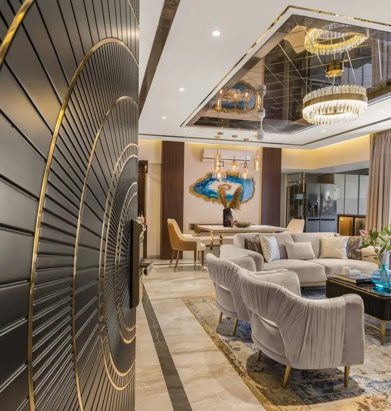
Several items in a walk-in wardrobe can be used as focal points, such as a large dressing mirror with ornamented edges, a decorative chandelier in the centre, or even your ceiling with a bold colour such as red.
It is not compulsory to have a single focal point in the room, you with your brilliance can create a series of focal points in the room.
Although it is important to mark the hierarchy, for example, the chandelier can be your main focal point, the island below will make a lesser but still significant statement, when turning to the side, the dresser mirror with delicate details, will make its mark.
Décor and artefacts
Without decor, space will look dull no matter its colour scheme and details. As said earlier, your accessories such as purses, shoes, jewellery can be your décor, a simple solution. But what if you opt for closed cabinets with solid shutters?
The room needs to have candid & bold art pieces, something to ogle at. Use abstract paintings to display on the wall or a dazzling chandelier, suspended from the ceiling.
If the space has open storage areas, you can use handmade rattan baskets to store your items or a bold floral pattern pouffe for the dresser. If you want to invest more in the décor, add a huge vase or sculpture at the corner that will serve both as a focal point and décor. You can also add an area rug in the space to make it appear more elegant.
Design and planning is an art and needs a lot of practice just like any other field.
Keep experimenting and keep doing awesome stuff.
Wish you luck
